
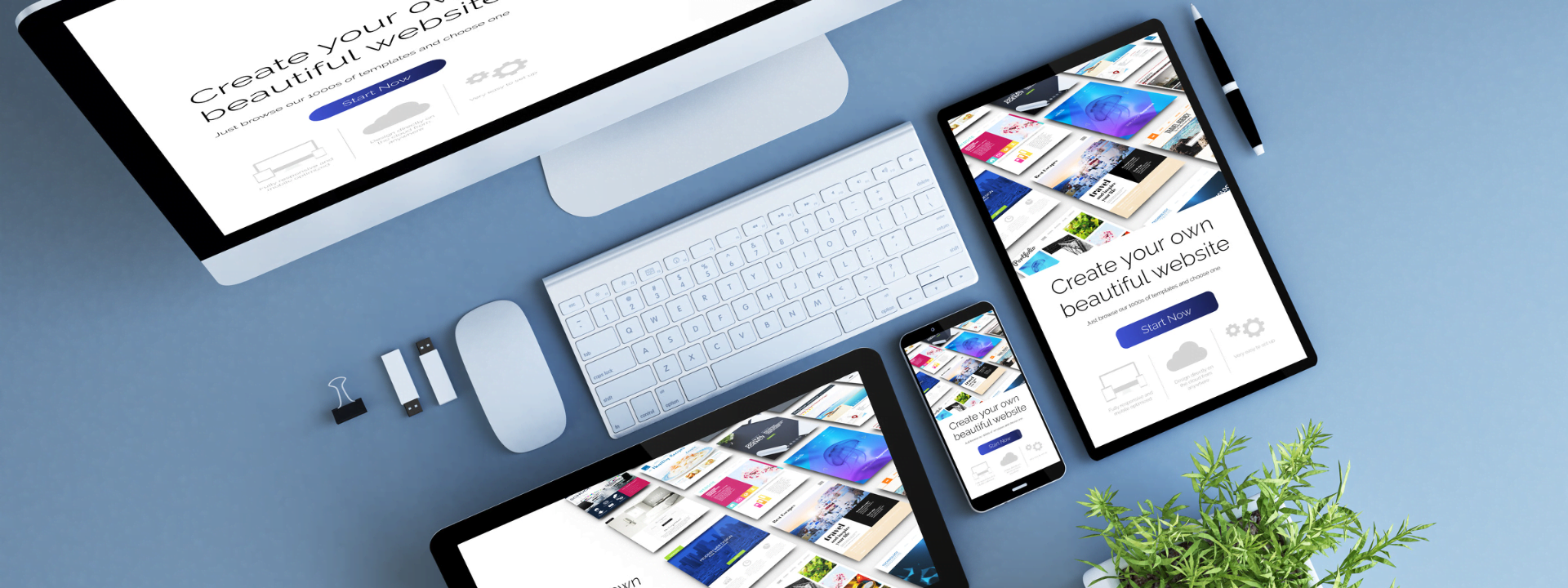
With the rise of mobile devices, responsive web design has become more important than ever. By creating a responsive website, you can ensure that your site looks great and functions well on all devices, including desktops, tablets, and smartphones. In this article, we’ll cover the best practices for responsive web design and provide tips on how to optimize your site for all devices.
- Use a Mobile-First Approach: When designing a responsive website, it’s essential to use a mobile-first approach. This means designing the website for the smallest screen size first and then scaling up for larger screen sizes. By doing this, you can ensure that your website looks great and functions well on all devices, including mobile devices.
- Optimize Images for Different Screen Sizes: Images play a crucial role in web design, and it’s essential to optimize them for different screen sizes. Use responsive images, which automatically adjust to the screen size, to ensure that your images look great on all devices without slowing down your site.
- Use Responsive Typography: Responsive typography is an essential part of responsive web design. Use fonts that are easy to read on all screen sizes, and ensure that the font size adjusts to the screen size. Use a scalable font size to ensure that your site is readable on all devices.
- Use CSS Media Queries: CSS media queries are a powerful tool for responsive web design. By using media queries, you can specify different styles for different screen sizes. This ensures that your site looks great and functions well on all devices.
- Test Your Site on Different Devices: Testing your site on different devices is essential to ensure that it looks great and functions well on all devices. Use testing tools, such as Browser-Stack or Cross-Browser Testing, to test your site on different devices and screen sizes.
Responsive web design is essential for ensuring that your site looks great and functions well on all devices. By following the best practices outlined in this article, you can create a responsive website that provides a great user experience on all devices. Alive Station are always follow the best approach to develop the most responsive for android, IOS or any other device device. Alive Station always provide responsive design to all of the project.
Remember to use a mobile-first approach, optimize images for different screen sizes, use responsive typography, use CSS media queries, and test your site on different devices to ensure that it looks great and functions well on all devices.

